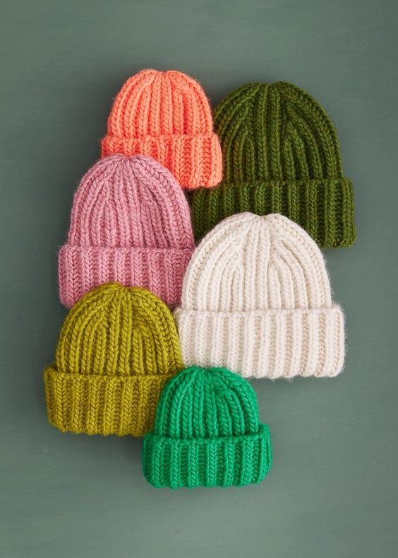
I’ve been swatching with the new colour of the year, can you tell?
![]()
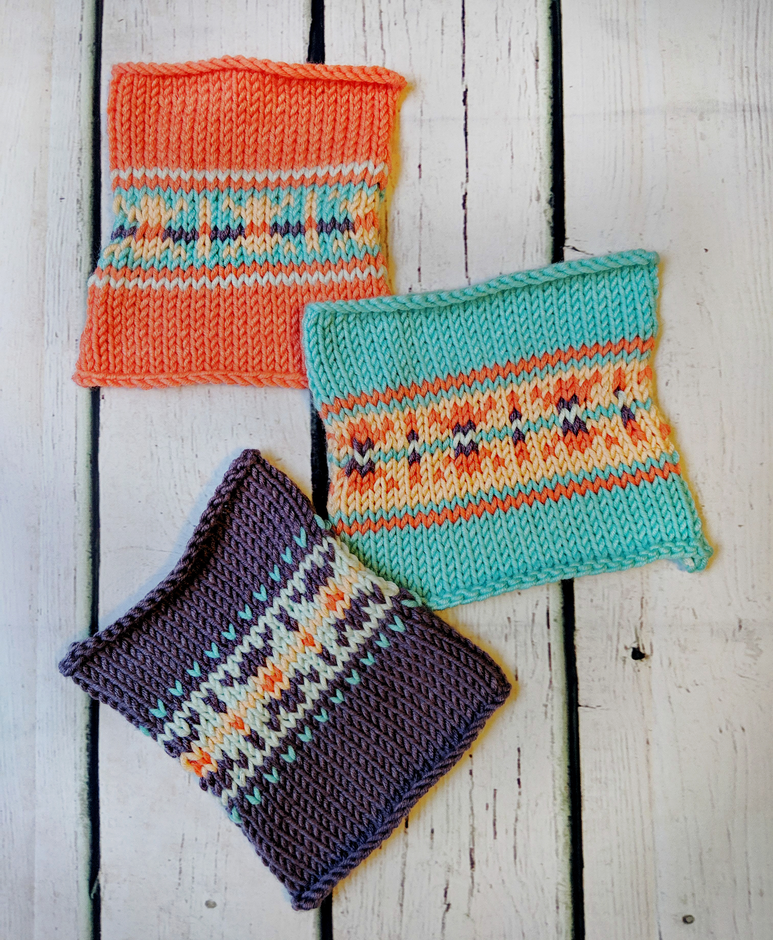
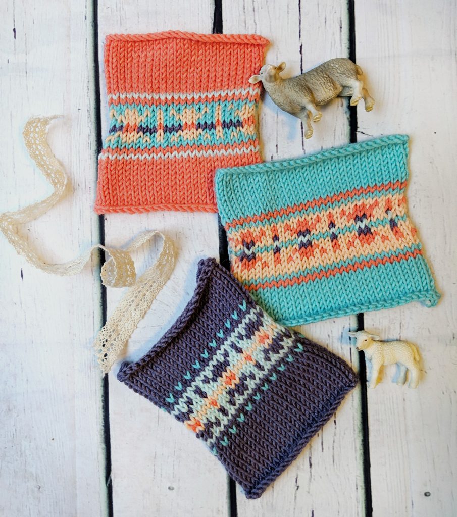
These are all the same stitch, one of the carts from Alice Starmore’s Charts for Color Knitting, since whenever I’m playing around with colourwork, I like to try out one of the charts from there.
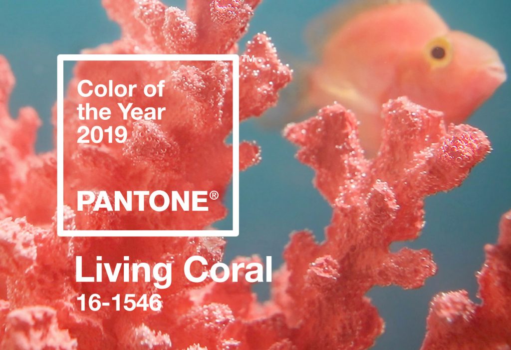
Pantone is the definitive authority on all things colour (what a job!), and each year they declare an official colour of the year that then pops up in clothing stores and accent pillows everywhere you look for the rest of the year. This year, they have declared 2019 Colour of the Year to be Living Coral:
Coral is a colour that I don’t mind as an accent, but not sure if it’s for me as a full colour, but I decided to experiment and try out somediffenret combinations and see what came of it. I’m not always great with colourwork – sometimes I can get a great combo right out of the gate, and other times I’m swatching and swatching and swatching… just trying to make it work. These three were all knit up with the Caron X Pantone in Blushing Coral, one of the new colour combinations they have *just* released:

(Blushing Coral is the combo in the upper left corner)
Some yarn specs: The yarn is a bulky weight 20% Merino Wool, 20% Nylon, 60% Acrylic, and each of those little buns has 127 yards/116 meters. They are available in Michaels craft stores or on Yarnspirations. It’s perfect for accessories, or for colourwork or stripes on larger projects. About the yarn weight- I thought it was more of anAran weight, and my swatches are knit up on 5m/US 8 and are wonderfully soft and pliable, no fabric stiffness at all. Is there such a thing as a ‘light’ bulky?
Trying a stranded design in a heavy yarn weight makes things looks so bold and graphic, I think. I like that pixelated quality it gets in larger yarns. I played around with varying amounts of the coral, from a tiny bit to lots of it:
It was an interesting challenge for me to play around with combining colours like this that I don’t normally choose. I want to stretch a little out of my comfort zone, and choosing colours that aren’t my typical choices had me looking at the combinations in a new way, and thinking about the way light and dark colourways can pair off, which should be a tiny accent colour and which should be more present, etc. Even just looking at the photo above with the four new combos for 2019 makes me wonder if the two on the left would be amazing together in a striped wrap.
Over on Yarnspirations they actually have a colourplay tool where you can select one of their patterns and then see what it would look like to swap out different colour combinations, different main colours, all kinds of stuff. It’s pretty addictive, and takes so much of the guesswork out of putting together combinations that you know you will love. It doesn’t work for charts of your own design or from other books, only for the free patterns on their site, but I think you’ll find what you are looking for. Or you can spend a lot of time swatching, if swatching is your jam.
And if you are looking for pattern ideas for these gorgeous little gems, there are pages and pages of them to be found over here – not a bad way to look for patterns that would be good for destashing some yarn, too.
** this post is sponsored by Spinrite yarns. All opinions and swatches are my own.**